The presidential election season is upon us.
Whether you’re ready or not, there’s a flood of new political candidates clamoring for your vote. In fact, at most recent count, there are 24 candidates in the race for the Democratic presidential nomination.
It’s hard to keep up.
But, we’re not here for the politics. We’re here for the branding.
With every election season, we’re exposed to a new wave of political branding.
We’re inundated with political commercials, lawn signs, banners, and bumper stickers. Indeed, there are so many elements at play in a political brand identity that we couldn’t possibly cover it all in just one article.
So, let’s lay out our ground rules.
We know that a brand encompasses so much more than design. It’s also the words you say, the actions you take, and the impact you make on the people and world around us.
Political branding is about how a political individual, organization, or campaign is perceived by the public. Importantly, in politics, just like in business, your brand is not what you say it is – it’s how others actually see your brand.
Since we specialize in visual brand identity at crowdspring, we’re going to focus on the elements that we think are among the most important to a strong brand – logo design and website design.
Over the last decade, our community of 220,000 designers has helped many local, state, and national political candidates with branding for their campaigns.
We’ve gained many insights along the way.
So, who’s doing it right and who’s off the mark?
Here are our insights about the branding in the democratic presidential primary race…
The Overview:
Most candidates running for the Democratic presidential nomination have done very little to successfully differentiate themselves through their branding.
Most of what you’ll see are variations on the theme of name-in-a-box (see Tim Ryan, Cory Booker, Julian Castro, Bill de Blasio, Michael Bennet or Beto O’Rourke) or plain wordmarks (see Elizabeth Warren, Tom Steyer, Marianne Williamson, Kamala Harris, Wayne Messam, Amy Klobuchar, etc.).
And, while it’s true that these candidates all generally have more or less professional-looking logos, few of the designs are very effective at differentiating a candidate from their competitors or embodying their vision for America.
Finally, remember that these observations do not reflect our political views – it’s all about the branding.
With that said, let’s take a look at the best and worst Democratic candidates have to offer.
The Best Political Branding of 2020
“Mayor Pete” Buttigieg
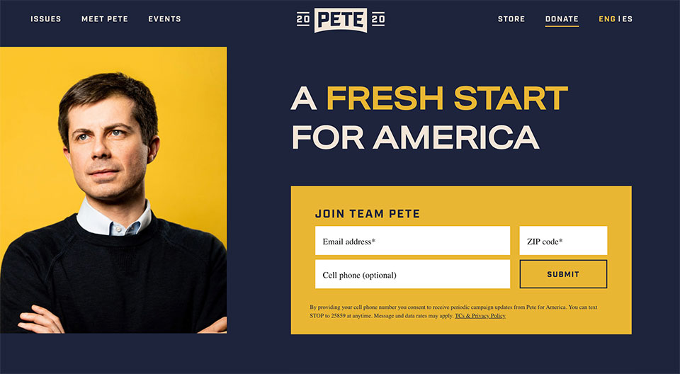 Image courtesy of Pete Buttigieg
So, Mayor Pete’s branding gets right what so many other candidates do wrong. His branding is unique and stands out from the pack, while still managing to look authoritative and reliable.
Pete Buttigieg (pronounced “Boot Edge Edge” as his clever merchandise tells us) wants the American people to know that his presidency would not be business as usual.
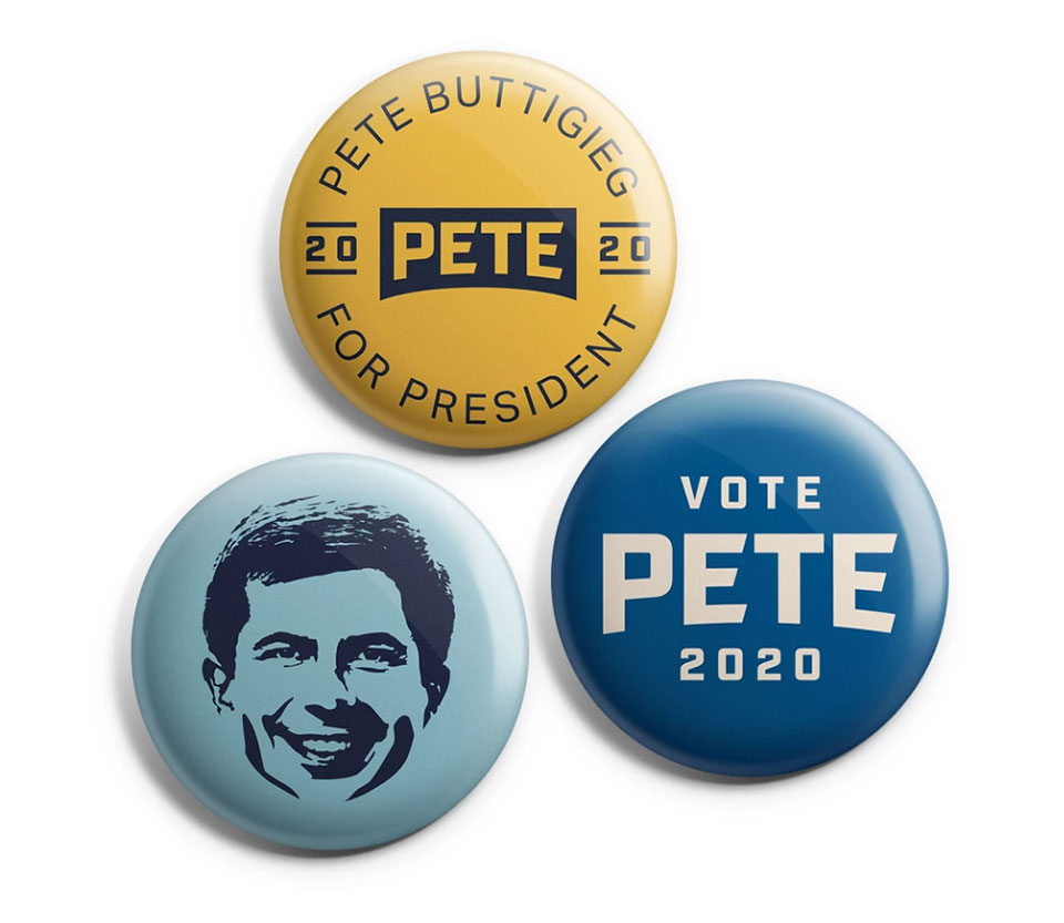 Image courtesy of Pete Buttigieg
You can tell this right away from the visual cues he’s provided with his fresh navy/mustard/dusty aqua color palette.
Navy anchors Buttigieg’s brand colors in the political realm, while the accent colors tell us that he’s willing to go off-script.
The slogan on his homepage – “A fresh start for America” underlines this message.
Marketing words matter – for politicians and for businesses.
Furthermore, Pete’s simple, but impactful logo manages to be one of the more visually interesting designs in the race.
His first name is featured in negative space block letters on a simple geometric banner. The election-year (2020) straddles his name evenly on either side, framed by straight lines above and below. The design places visual emphasis and draws focus to the candidate’s name.
We love the design toolkit his campaign provides, including graphics with matching state fonts that allow states and other geographic areas to show their support for Mayor Pete in their own unique ways.
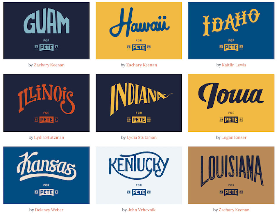 Image courtesy of Pete Buttigieg
And, Buttigieg gets extra credit for the well-designed merch available in his signature color palette.
Overall, Mayor Pete’s branding is successful in communicating his brand as a fresh, new face in Washington who wants to disrupt politics as usual.
Bernie Sanders
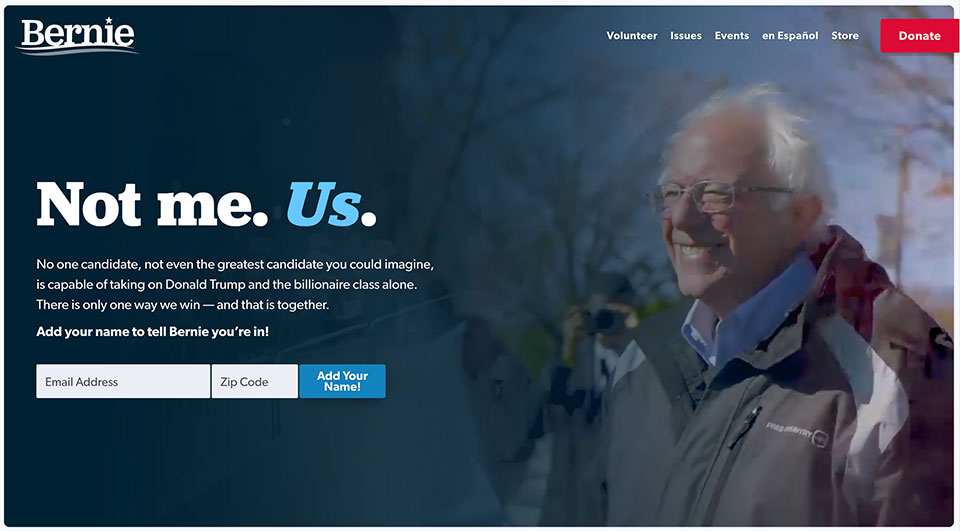 Image courtesy of Bernie Sanders
Bernie Sanders’ logo is almost unnecessary. This seasoned politician has already put in the years (and previous presidential runs) to establish a known brand. But his logo works hard for him anyway.
You see, Bernie’s got a bit of a reputation. His strong convictions and impassioned speech have given some the impression that he’s angry. With that in mind, Bernie’s logo is a very wise choice.
The serif font and use of only his first name are downright friendly. This is a powerful visual counter to his opponents’ narrative of the cranky old guy.
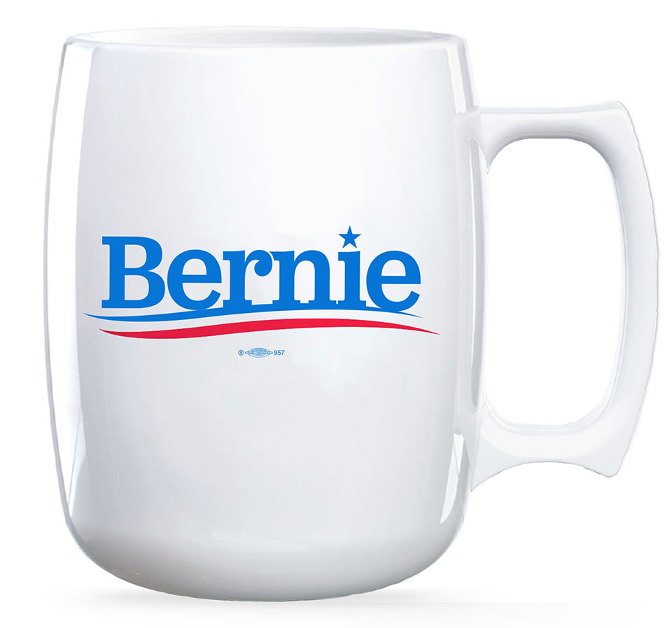 Image courtesy of Bernie Sanders
And, lest you think Bernie is all personality and no patriotism, the logo includes a star and stripes. The curved stripes (and almost adolescent call-back of using a star to dot Bernie’s “i”) are playful – and again, friendly.
Bernie’s brand is that he is an accessible man of the people, for the people. His powerful slogan reads, “Not me. Us.” And his logo encourages us to remember that he is an eminently relatable patriot.
Bernie’s website is immediately engaging as well. Video clips of Sanders interacting with constituents draw you in and reinforce the message that he is fighting beside you.
Finally, I would be remiss if I didn’t mention the amazing bird favicon on his website. The small blue bird sports Bernie’s signature shock of white hair. This charming inclusion shows off Sanders’ sense of humor and playful spirit.
Bernie Sanders’ branding does an excellent job of taking the sharp edges off his passion; leaving you with the impression of a feisty, but capable, grandpa who would give everything for you.
Kamala Harris
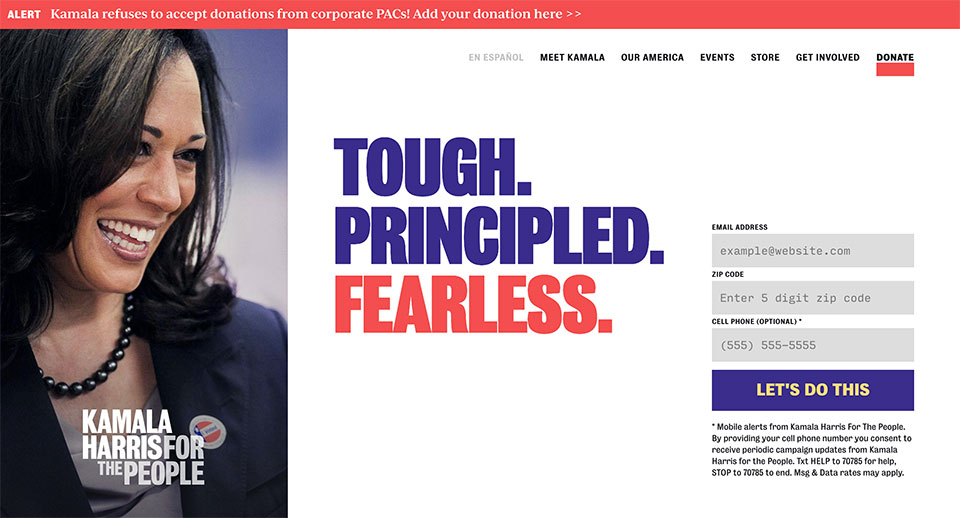 Image courtesy of Kamala Harris
If you’re not sure what Kamala Harris stands for, just read her logo.
While it isn’t the most artistically brilliant design, the logo is effective in communicating Harris’ brand. The wordmark consists of both her name and her campaign slogan in red and indigo block letters. This leads Harris’ slogan to become indelibly linked to her name – making both more memorable.
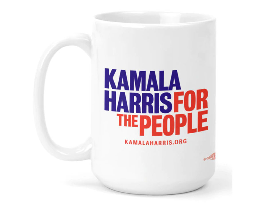 Image courtesy of Kamala Harris
Furthermore, the arrangement of the words in Kamala’s logo create a shape unlike any other logo in the race. This makes her logo instantly recognizable by silhouette alone. With so many other brand marks that rely on visually similar boxes or single lines of text, this design stands out.
And, while Kamala’s website won’t win any awards for groundbreaking design, it does smartly feature the most important details she wants you to know about her brand – “Tough. Principled. Fearless.”
By showing this message center-screen on a field of white, the words are impossible to miss and take on a clear significance.
If you visit Kamala Harris’ website just once, you know who she is and what her candidacy is about in one quick glance.
The Worst Political Branding of 2020
Elizabeth Warren
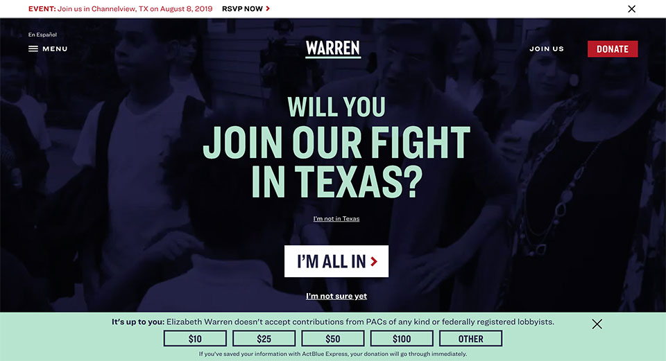 Image courtesy of Elizabeth Warren
The most interesting thing about Elizabeth Warren’s branding is its color palette. Unfortunately, that color palette is bad.
The seasoned and respected senator’s logo design is dull. The logo, a minimalist navy wordmark in an angular sans serif font with a single underline, simply reads “Warren.” There’s nothing to capture the eye or make the logo stand out from the pack in any way… unless you see the two-color version.
The two-color version of Warren’s logo places the wordmark in white and the underline beneath in bizarre seafoam green.
The green accent color appears throughout the candidate’s website design. And that would be okay – if it weren’t paired with navy and a deep crimson red. But it is.
Political branding status quo demands that candidates use the national colors. This helps to show off their patriotism – and help casual passers-by easily recognize a political brand.
I suspect the awkward color palette is the result of trying to merge these traditional guidelines with a more unique color to help reflect the Senator’s unique identity and differentiate her from the competition.
Whatever the reason, the color palette makes her website a difficult-to-read eyesore. The unfortunate impact of this color combination sadly overshadows her brand and her message.
Joe Sestak
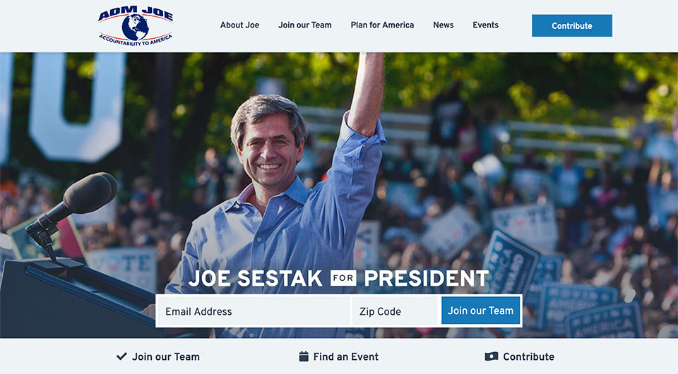 Image courtesy of Joe Sestak
In a field of mostly generic logos, candidate Joe Sestak’s visually unique logo stands out. But, not in a good way.
Sestak’s logo features a globe enclosed by curved red lines on top and bottom. The globe has a retro feel. And the position of the globe between the two red lines closely resembles an eye. The symbolism is clear – the world is watching you. And, it feels ominous.
In an age where many Americans already feel like they’re living in a dystopian reality a la Orwell’s 1984 or Margaret Atwoods’s The Handmaid’s Tale, aligning your campaign brand with “Big Brother” style imagery is a questionable choice.
And, putting aside the purely visual aspects of the logo, the text doesn’t improve the logo at all. The arching text on top reads “ADM JOE.” As a civilian, I had no idea what ADM meant – and I’ll bet I’m not the only one.
I had to do quite a bit of searching on Sestak’s website before I was able to determine that ADM stands for Admiral. It isn’t mentioned even once on the candidate’s home page. And, that’s a real failure of execution. If Sestak’s status as an Admiral is important enough to feature in his logo, it’s worth mentioning on his website’s home page – if only to avoid confusion.
Overall, Sestak’s brand comes across as out-of-touch, disjointed and vaguely ominous.
Marianne Williamson
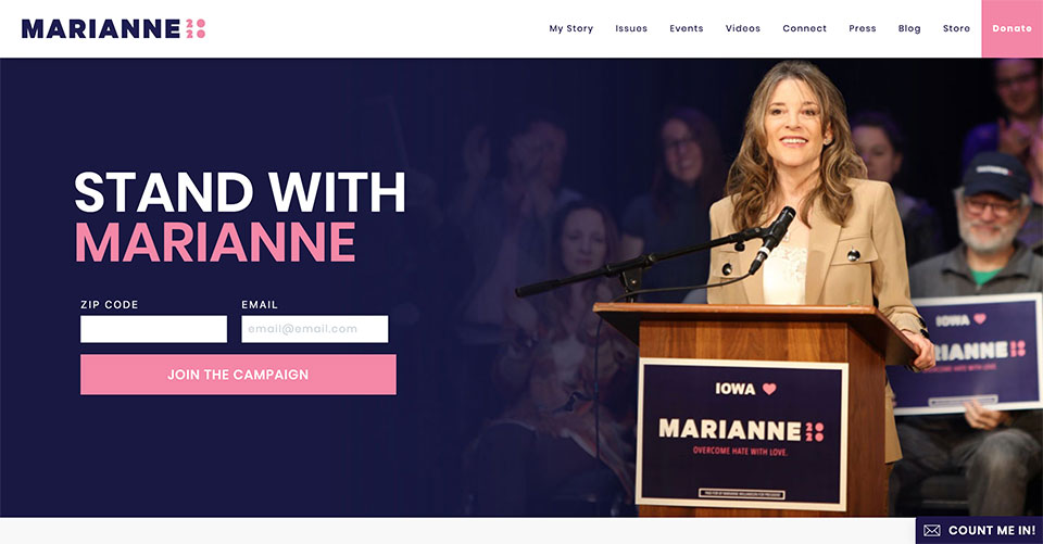 Image courtesy of Marianne Williamson
Candidate Marianne Williamson’s branding does a good job of communicating that she’s not your usual political candidate – because it fails to make her look like a political candidate at all.
Williamson’s logo simply features her first name in navy block letters followed by “2020” in a bubblegum pink novelty font.
Sadly, the novelty font is nearly illegible from only a short distance away. So, instead of seeing Marianne 2020,” one instead sees “Marianne” followed by 4 pink squiggly dots.
Additionally, Williamson’s branding is peppered with hearts and a pink accent color that belies the seriousness of the political mission she’s undertaken.
And, further distancing her brand from its own political aspirations is the vagueness of her slogan. Her website encourages visitors to “Stand with Marianne.” But, to do what?
It’s understandable that Marianne Williamson wants to visually show the distance between her own experience and that of her “business-as-usual” political competitors. But, her branding fails because it only shows what Marianne isn’t, without providing a narrative for who Marianne is.
Honorable Mentions
There are so many candidates in the 2020 democratic presidential primary race that it’s impossible to cover everyone in this article.
While some candidate’s branding did stand out as the best or worst overall, we would be remiss if we didn’t include a handful of well-deserved honorable mentions.
And here they are…
Best Logo – John Hickenlooper
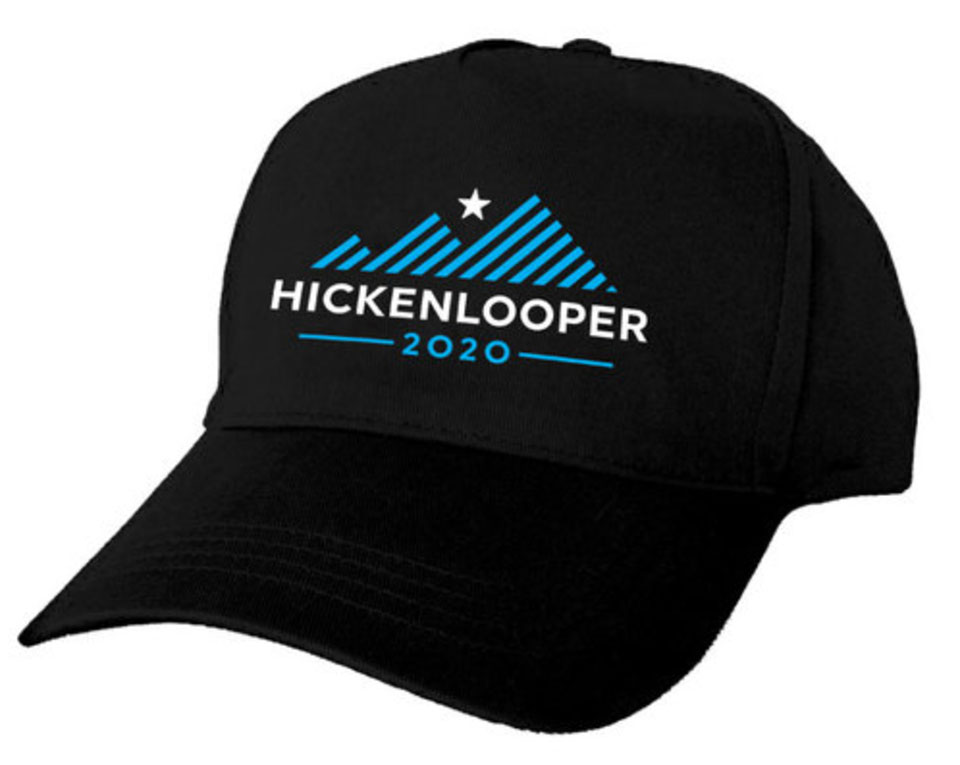 Image courtesy of John Hickenlooper
You may not even have heard of John Hickenlooper. But he’s got the best logo of the current Democratic candidates.
His logo features three-striped mountains, ascending in height from left to right. And, above them, shines a single star. His name and running year serve as the foundation of the mountain range.
Hickenlooper’s logo communicates growth as each successive mountain (flag?) reaches higher. The star shining above implies dreams and aspirations. And placing Hickenlooper’s name below visually suggests that the ability to achieve growth and reach dreams rests squarely on him.
However, Hickenlooper’s website and slogan fail to follow through on the promise of his logo. So, we sadly couldn’t include him on our “Best” list.
Weakest Logo – Seth Moulton
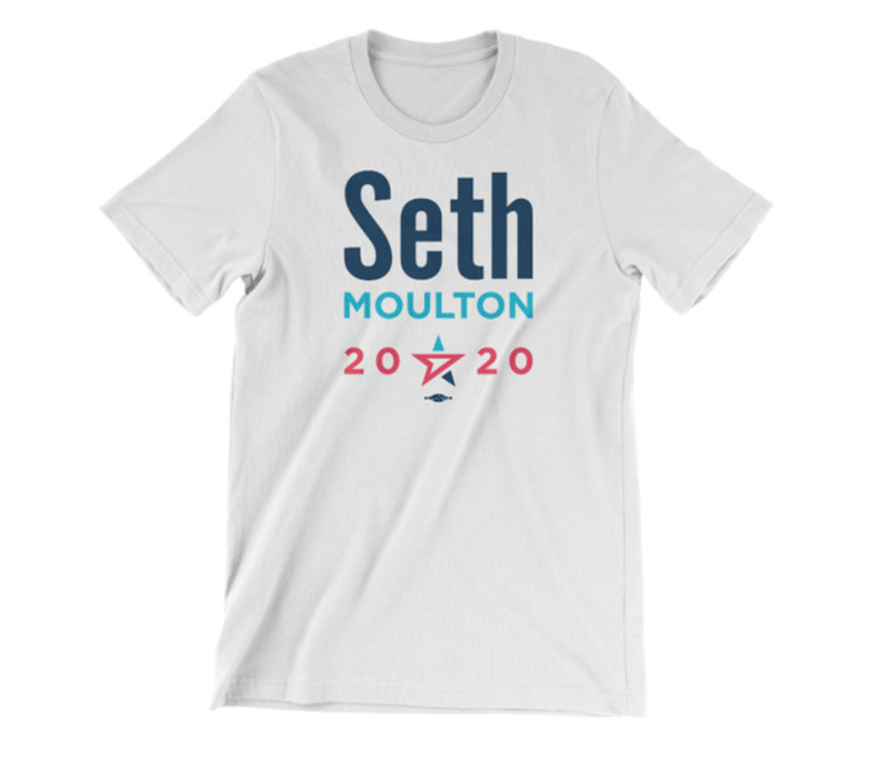 Image courtesy of Seth Moulton
Seth Moulton gets an honorable mention for having the weakest logo.
Moulton’s logo visually emphasizes his first name – but, as a largely unknown underdog candidate, that’s not a great strategy. And the visual design does little to provide constituents with more information.
The overall layout of Moulton’s logo has too much white space. The line spacing is so broad that the whole logo seems floaty and unconnected. This also weakens the logo’s impact when placed on merchandise and signage.
The most interesting aspect of the logo is completely overwhelmed by the not-very-interesting text around it. A single star, featuring a cursor pointing forward, appears beneath Moulton’s name.
This symbol does a good job of visually combining themes of patriotism and forward momentum. If this star element were made the focal point of Moulton’s logo (rather than a visual afterthought), the design could have been far stronger.
Best Merch – Andrew Yang
 Images courtesy of Andrew Yang
Andrew Yang snags an honorable mention for his truly fabulous merch.
His products are witty, unique, and consistently on-message with his campaign’s brand. And, if you don’t yet know why Yang would dedicate an entire line of campaign merchandise to math, you may just be intrigued enough to find out. That’s effective branding.
And, honestly, who doesn’t want a MATH hat? I’m terrible at math and I want one.
Well done, Andrew Yang.
Before we step away from the podium…
The best political branding – like any branding – differentiates you from your competition by featuring your unique personality, perspective, and value proposition.
That’s no easy feat.

